Customer / Discover
A catalogue that guides
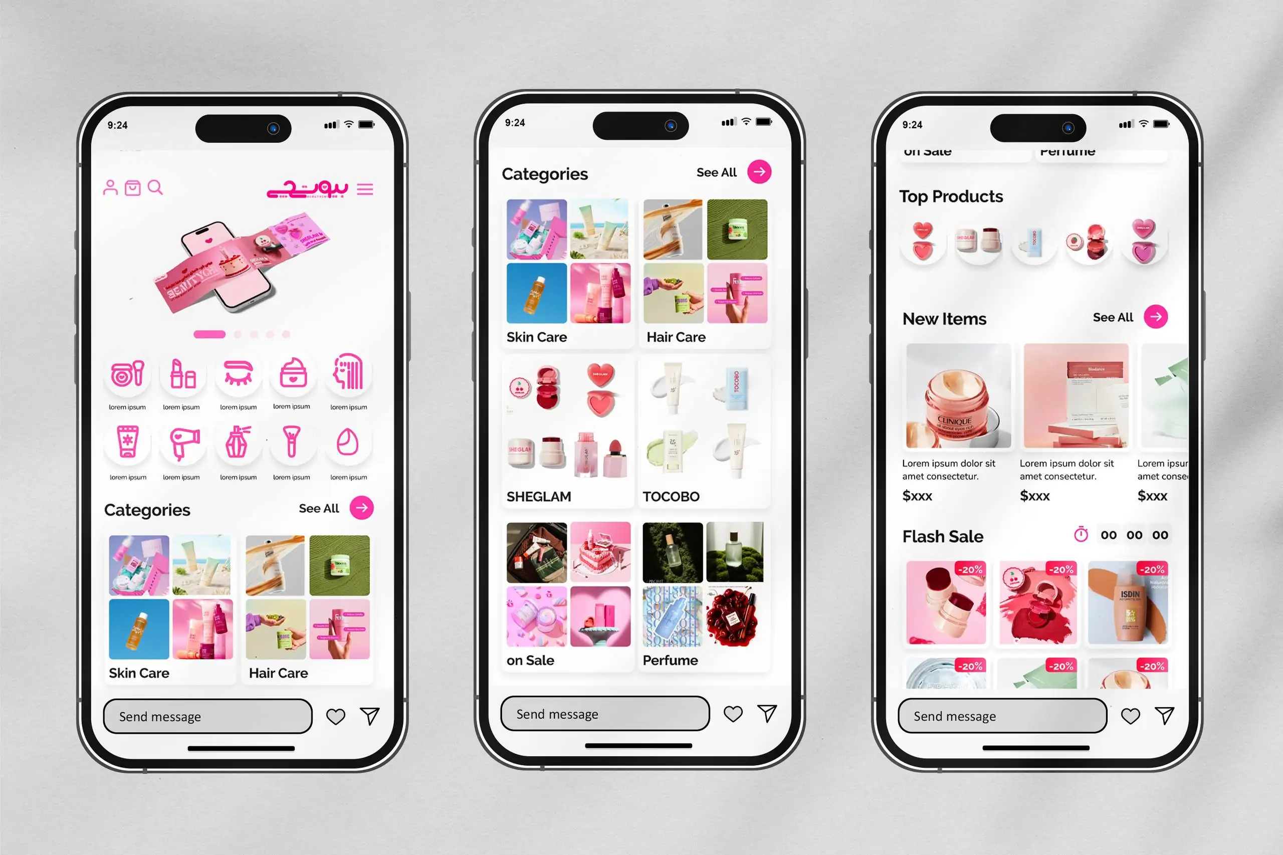
Responsive category pages, search, filters, canonical product routes, education, related items, and editorial content help people narrow a large catalogue without losing context.
Project detail / Product design + engineering
01
Beautychi began with a bright visual identity and a mobile storefront. As the business grew, the work expanded behind the interface: catalogue logic, pricing, checkout, operations, content, payments, and production infrastructure all had to behave as one product.
Product design + engineering / Beautychi / 2024—ongoing
02 / The problem
How do you keep beauty shopping simple when the business behind it is anything but?
Beauty products arrive with variants, changing stock, layered discounts, delivery constraints, and different payment rules. Customers should not have to understand any of that complexity. At the same time, the team needs enough control to manage every exception without relying on scattered spreadsheets or fragile manual steps.
03 / The journey
The work moved outward from the identity into every part of the buying and operating loop.
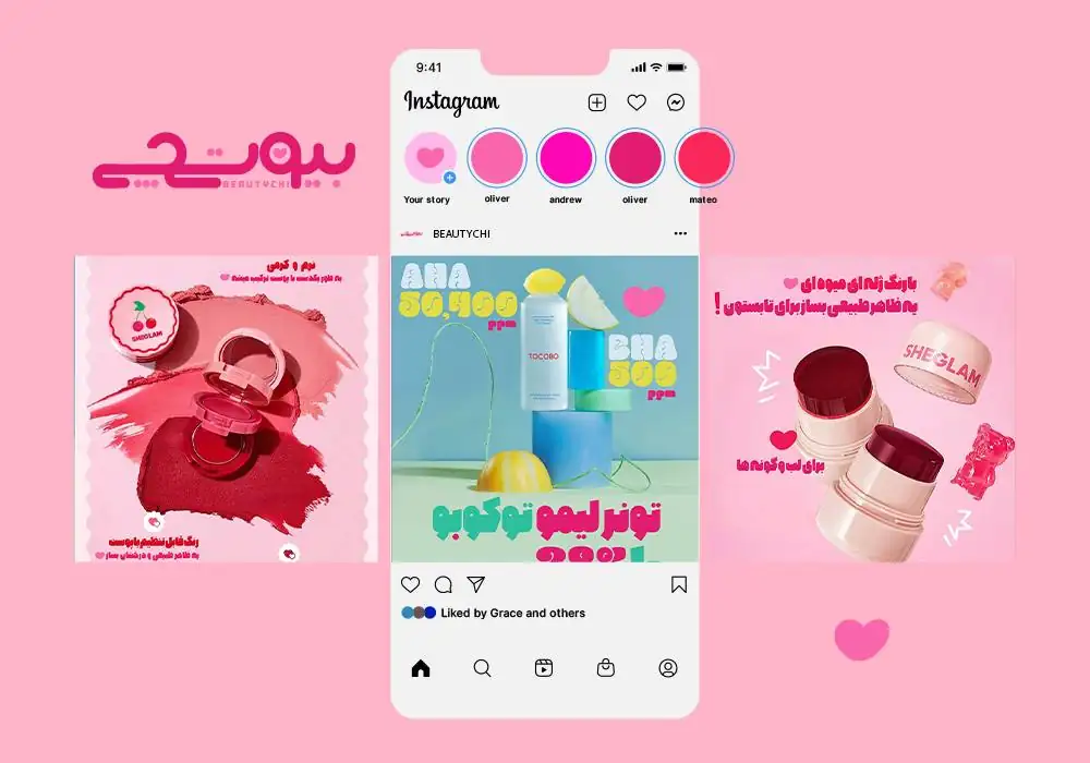
Build a Persian-first identity around an expressive wordmark, a heart motif, vivid pink, and an editorial product-image system.
Turn categories, filters, search, related products, editorial content, wishlists, and recently viewed items into one coherent path.
Keep cart, stock, coupons, shipping, Zibal, and SnappPay pricing consistent from the first total to the final payment state.
Connect catalogues, orders, customers, fulfilment, reviews, notifications, and content through one typed administration system.
04 / The system
The memorable interface is only half the work. Beautychi shares the same product, pricing, inventory, and order truth across the customer experience and the back office.
Customer / Discover
Responsive category pages, search, filters, canonical product routes, education, related items, and editorial content help people narrow a large catalogue without losing context.
Customer / Buy
Cart totals, shipping thresholds, coupons, direct payment, and instalments use shared server-side rules so the amount stays explainable at every step.
Team / Operate
The team manages products and variants, stock, orders, customers, shipments, closure dates, reviews, promotions, and editorial content from one admin experience.
System / Recover
Checkout revalidates what can be sold, pending payments are reconciled, coupon locks are released safely, and operational errors become visible instead of disappearing.
05 / Visual language





06 / Outcome
Beautychi now behaves as a commerce system, not a collection of screens.
The product continues to evolve as catalogue, payment, fulfilment, and content needs change.
Back to works